Travel Money App redesign
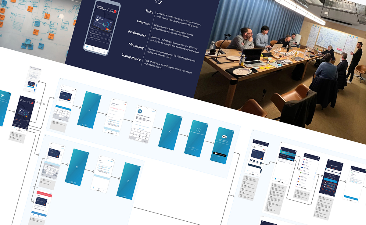
Show case introduction to this project I worked on with Travelex.
My role
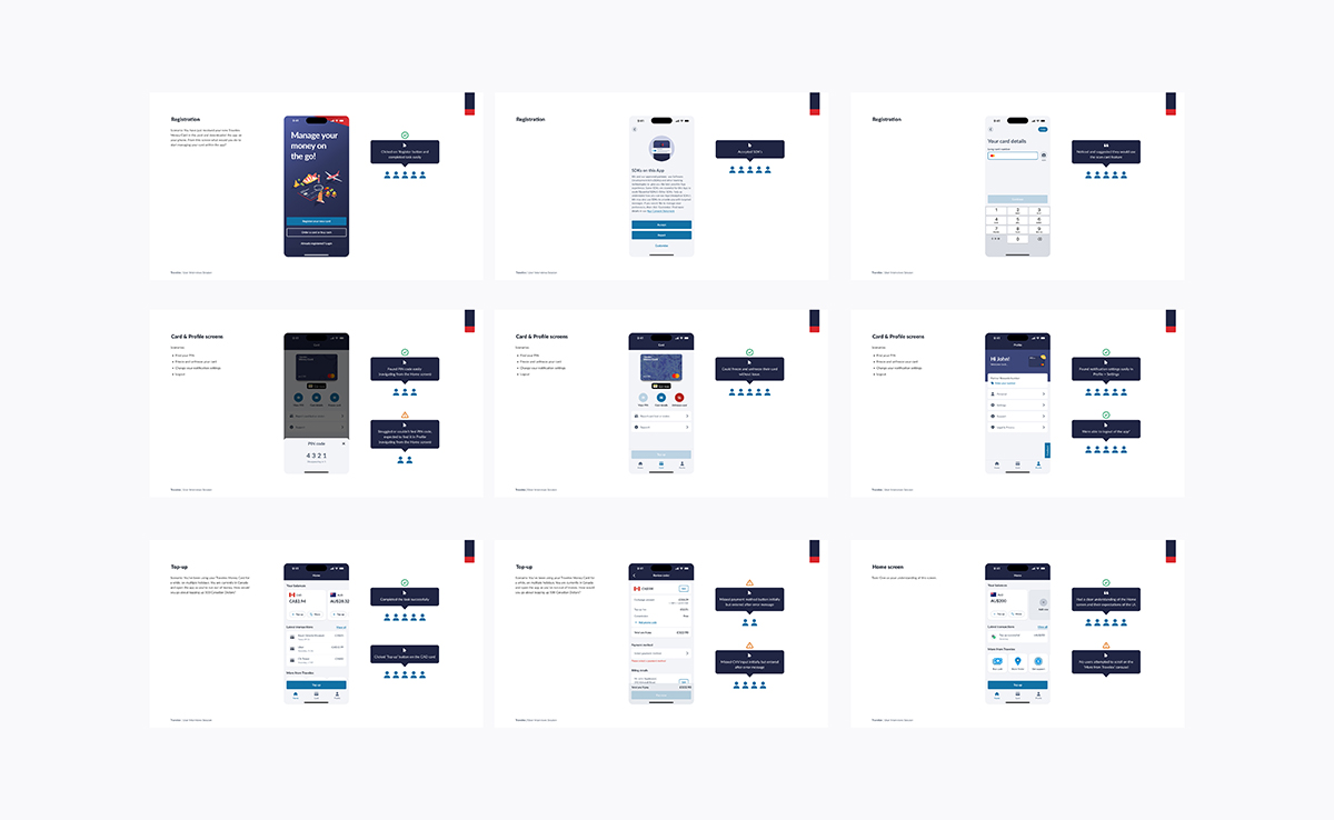
I was the lead Product Designer of only two allocated design resources on the project, paired with a contracted development team from the agency Nearform. Together we delivered end-to-end UI, from wireframes to high-fidelity designs and prototypes, working to an aggressive timeline in an agile way. This project was the first to use our new tokenised UI library and followed a white-label-first approach to support future partner theming.
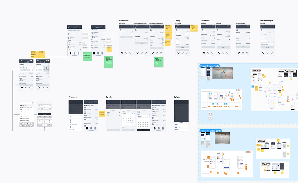
Core task-flows and functionality were explored and iterated using a mix of Figjam & Figma, with the project team.
Outcomes
Within the first six months of the initial rollout:
- 10% year-on-year increase in conversion rates
- Decrease in top-up failures
- Measured improvement in usability
- Improved accessibility
- Validated MVP experience to layer ongoing enhancements
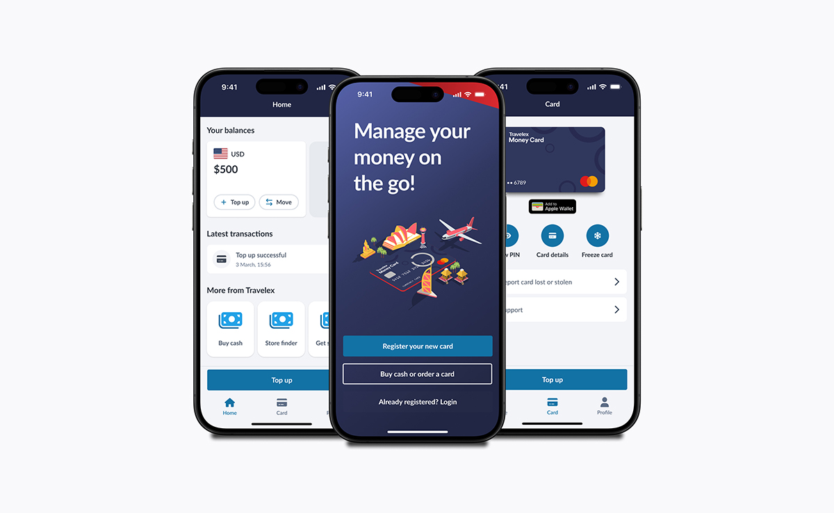
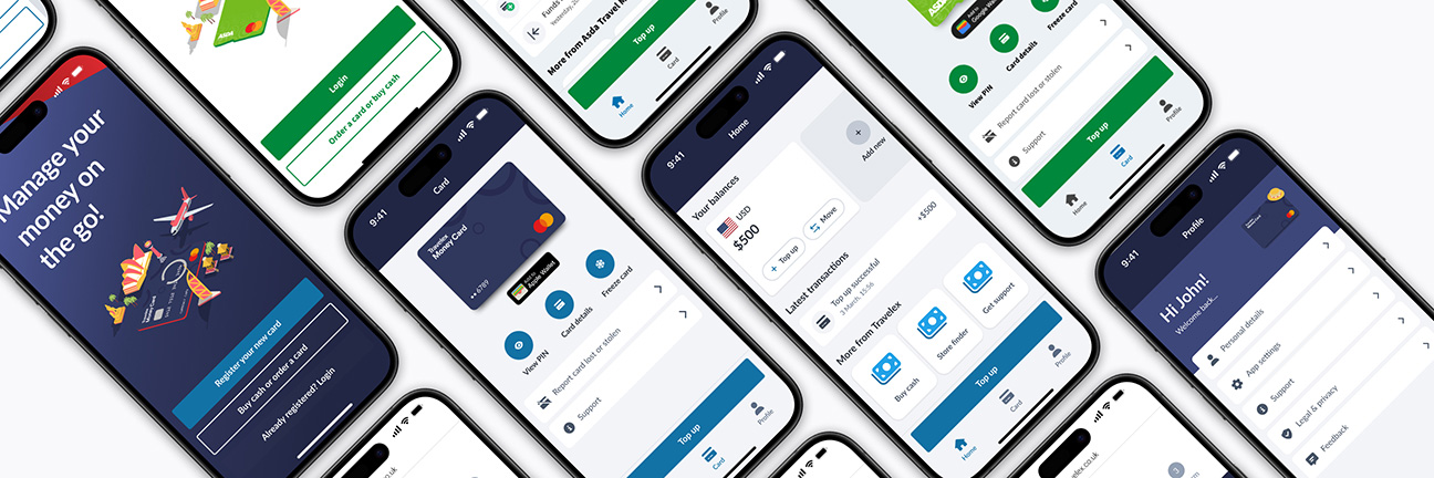
Example final hand-off UI for some of the core app screens: home (left), first entry (centre) and card management
If you have the time, you can read more on this showcase.
 Project details