The Travelex Design System serves as a comprehensive library of reusable UI components, themes, tokens and instructional documentation. With the ability to be applied across app and online assets, it creates consistency, build efficiency and improves product usability.
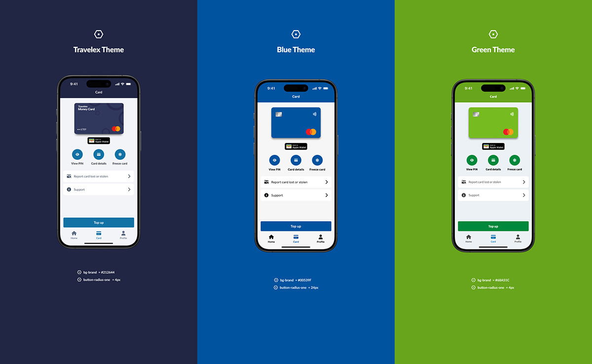
When I joined Travelex in 2023, there was no design team or design system in place. UI components for the website and app were being created ad hoc by developers, resulting in visual inconsistencies, accessibility issues, and significant inefficiencies in the development process. As Travelex also white-labels its currency checkout and money card app, there was no scalable way to switch brand themes using design tokens. A centralised design system was agreed as a business priority.
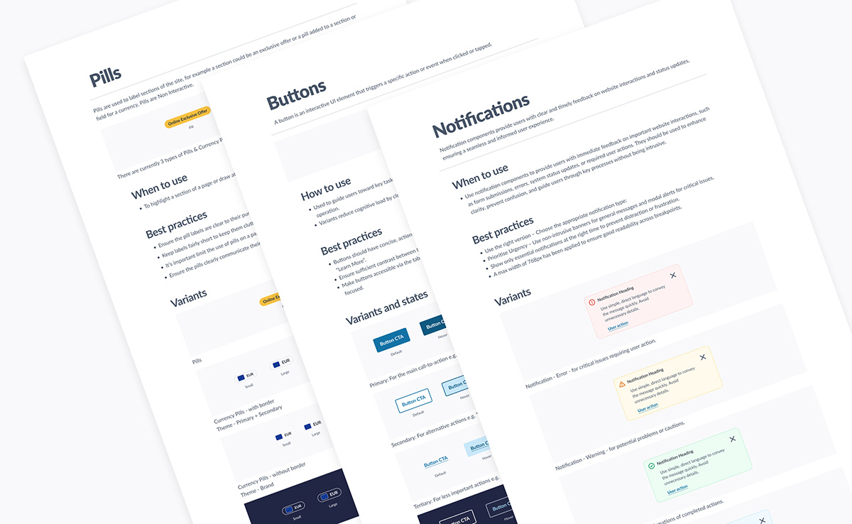
I led the design-side development of the Travelex Design System, working closely with product owners and engineers to create a scalable, tokenised component library. My responsibilities covered foundational design decisions through to system implementation and documentation. The timeline included initial audits, setup, and ongoing iterations to support evolving product needs across platforms. Figma based UI libraries served as the core, but the Design System took in the Travelex and partner brands, tokenisation, documentation and Storybook integration - plus all the associated governance and working processes.
ClientTravelex
Year2023-25
CollaboratorsProduct owners, Internal stakeholders, My design team, Internal engineering team
Tools & techFigma, Storybook, Fontawesome, Untitled UI, Jira, Confluence, Sanity
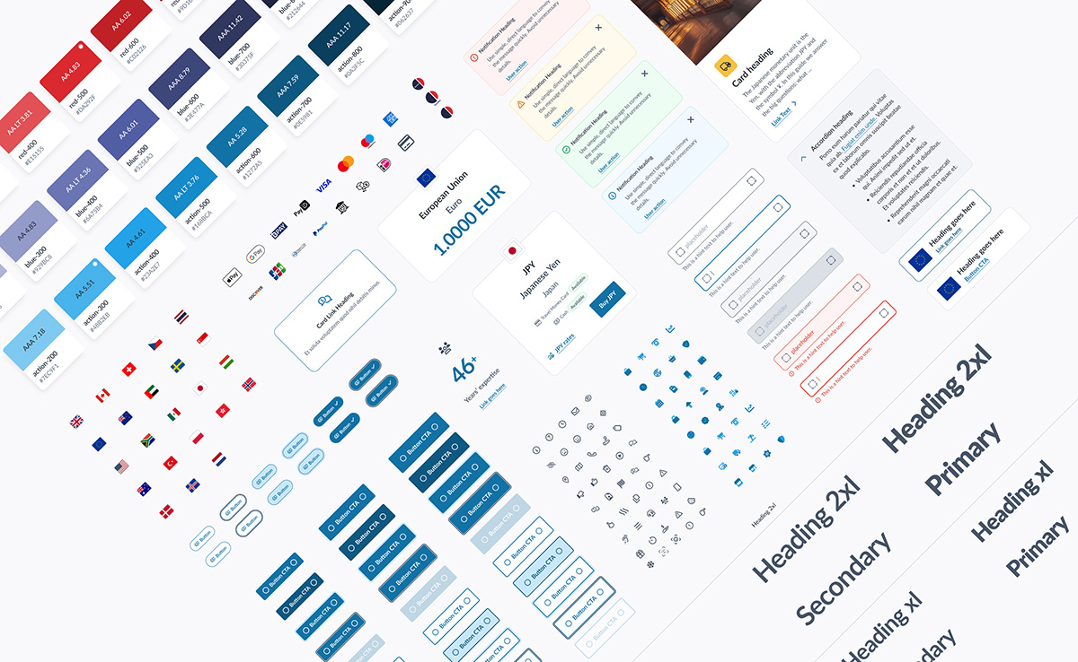
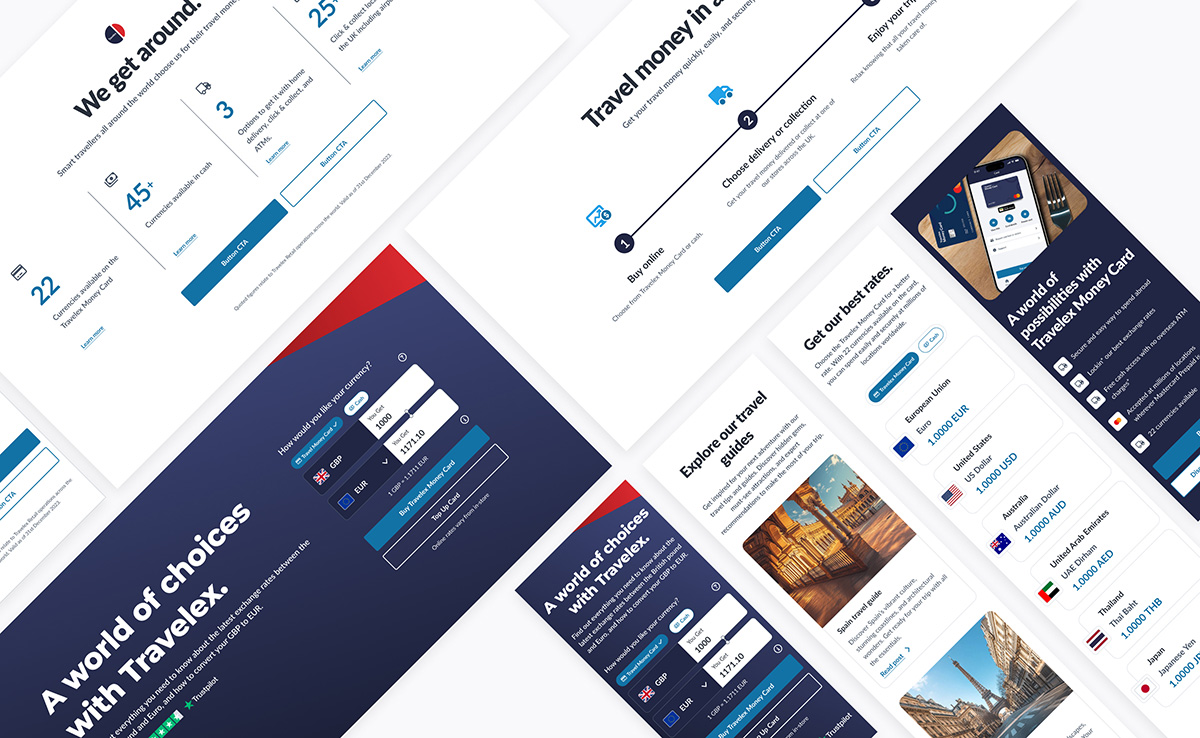
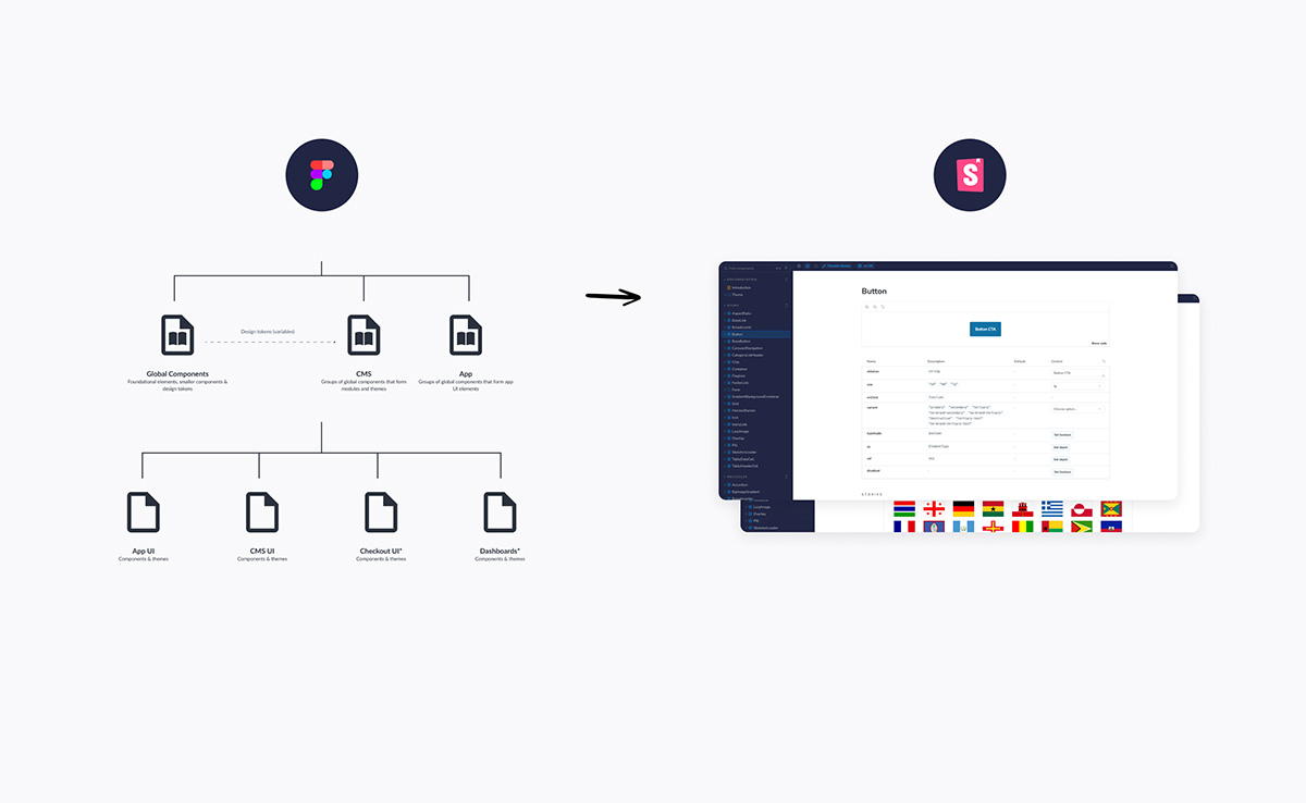
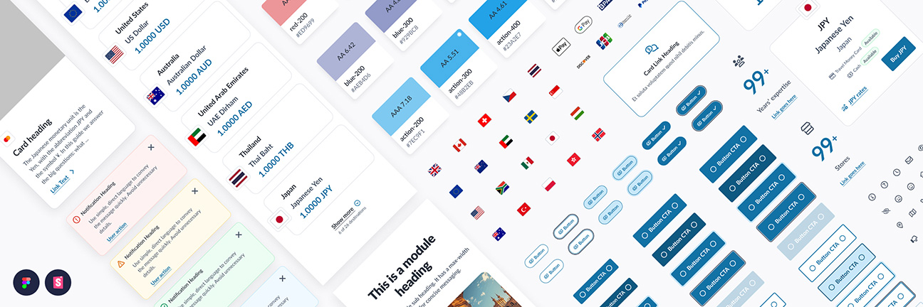
Extract compilation from a Global Components & Foundations UI library, which also housed design tokens (Figma variables)