International website redesign (currency exchange)
Show case introduction to this project I worked on with Travelex.
My role
Following an extensive audit of the current site content and UI requirements with relevant stakeholders, I Ied the internal design team, with a hands-on approach. I defined the design strategy, from an atomic approach to my team creating, documenting and handing off new UI components to engineering - to then generating the new modules and templates from them.
To support project, I also recruited two UX contractors, who became integral parts of this process. After a six month build process, following Agile methodology, we had populated a Figma UI library with online components, that were mirrored in Storybook - and were feeding a new headless environment in Sanity.
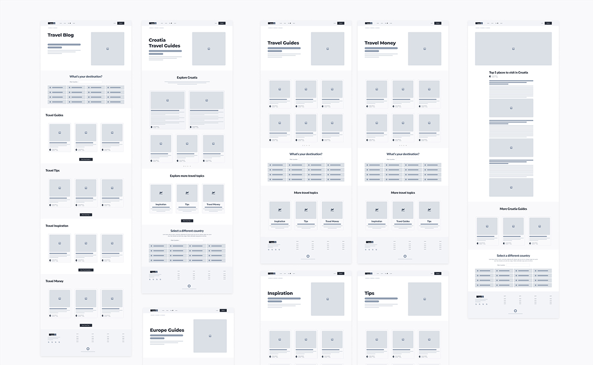
Some example wireframes created to explore the information architecture of the ‘Travel Blog’ section of the website, on desktop.
Outcomes
Uptick in page conversions
Improvement in CSAT scores
Positive stakeholder impact
Improved accessibility
Justification from UK tests for a regional roll-out
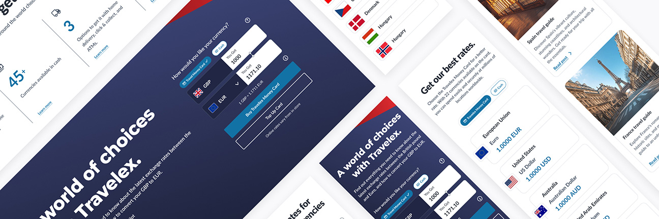
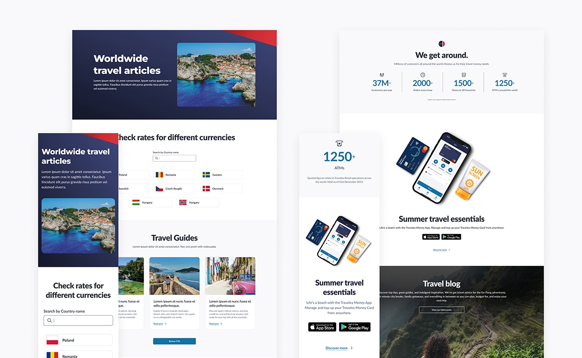
Mobile and desktop variants of reusable modular templates, compiled with global UI components.
If you have the time, you can read more on this showcase.
The Travelex website has twenty international versions on a single CMS, largely controlled by local regional teams. The key goal of most of these sites is to guide, or support customers who wish to purchase travel money. This includes information on available currencies, other products and fulfilment methods, plus access to the checkout process.
Objectives
Due to some historical events, the Travelex websites and supporting CMS, were suffering from some significant neglect and known issues. There was no UI consistency. Regional teams, with their own CMS access, had created a multitude of different component patterns and page templates. There was widespread neglect for the brand and UX design principles. The version of the Umbraco CMS was also that old that supporting it and remaining compliant was difficult. All this, resulted known usability issues and technical debt.
Using the UK site as a starting point, the business decision was taken to redesign the site, and re-platform in a new headless environment.
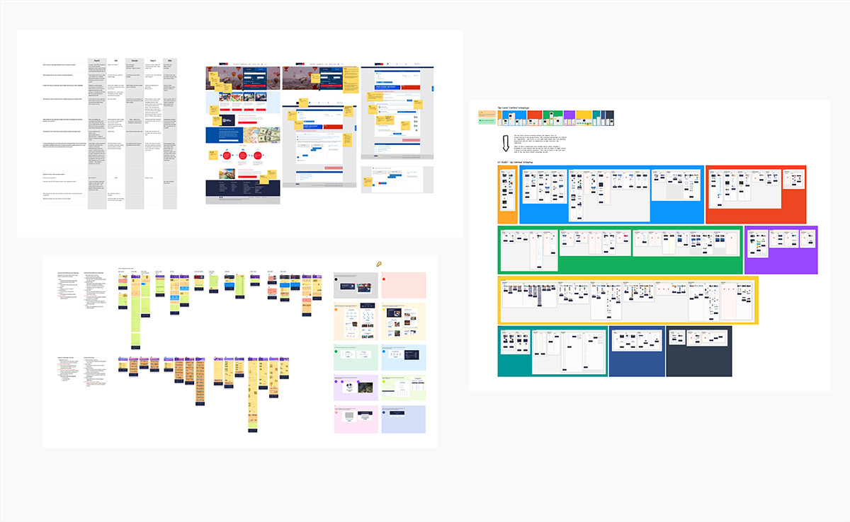
Testing and auditing the current UK site was part of the discovery phase, leading to boards of captured data to aid interpretation.
Incorporated processes
Discovery & definition
Group ideation
Hi-fi and prototype designs
User testing
Post launch impact reviews
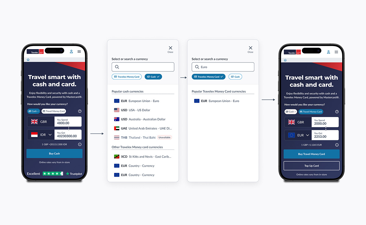
Designing and testing the product and currency selection the home page widget.
 Project details